
Visualization#
DPG includes graph renderers, feature-importance comparisons, predicate-space plots, and class-boundary views.
This page collects the plotting entry points, theme options, and example outputs used throughout the Read the Docs site.
Overview#
For most projects, the easiest workflow is:
from sklearn.ensemble import RandomForestClassifier
from sklearn.datasets import load_iris
from dpg import DPGExplainer

X, y = load_iris(return_X_y=True, as_frame=True)
model = RandomForestClassifier(n_estimators=5, random_state=42).fit(X, y)

explainer = DPGExplainer(
    model,
    feature_names=X.columns.tolist(),
    target_names=["setosa", "versicolor", "virginica"],
    dpg_config={
        "dpg": {
            "default": {
                "perc_var": 1e-9,
                "decimal_threshold": 2,
                "n_jobs": -1,
            }
        }
    },
)
explanation = explainer.explain_global(X.values, communities=True)
Themes and palettes#
DPG plotting supports a first-class theme API.
Most plotting entry points accept:
theme="dpg": the branded DPG visual styletheme="legacy": a more neutral, backwards-leaning visual stylepalette="default": the default DPG class palettepalette="olive": an expanded palette with more green and olive tonalities
The figures on this page were regenerated with the DPG themed palette.
Example:
explainer.plot_lrc_importance(
    X,
    explanation=explanation,
    dataset_name="Iris",
    theme="dpg",
    palette="olive",
)

explainer.plot_top_lrc_splits(
    X,
    y,
    explanation=explanation,
    dataset_name="Iris",
    class_names=["setosa", "versicolor", "virginica"],
    theme="legacy",
)
You can also inspect the resolved theme programmatically:
from dpg import resolve_theme_context

ctx = resolve_theme_context(theme="dpg", palette="olive")
print(ctx["class_palette"])
Main chart types#
1. Standard DPG graph#
Use explainer.plot(...) or dpg.plot_dpg(...) to render the Decision Predicate Graph.
explainer.plot(
    "iris_dpg",
    explanation,
    save_dir="results/",
    attribute="Local reaching centrality",
    theme="dpg",
    palette="default",
    layout_template="vertical",
    label_mode="wrapped",
    readability="presentation",
    fig_size=(14, 14),
    title="Iris Decision Predicate Graph by Local Reaching Centrality",
)
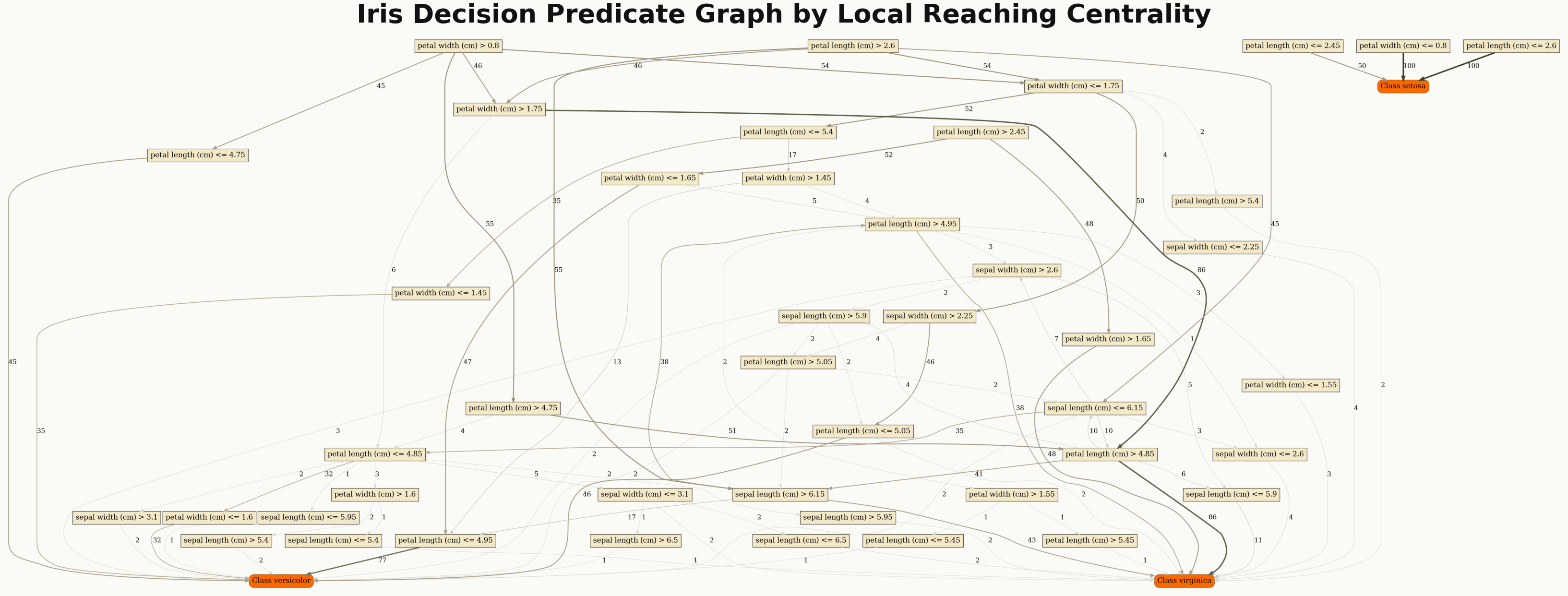
Standard DPG rendering colored by Local Reaching Centrality.#
Useful options:
attribute: color nodes by a metric such asLocal reaching centralityclass_flag=True: highlight class nodeslayout_template: choose fromdefault,compact,vertical, orwidelabel_mode: choose fromfull,wrapped, orshortreadability: choose fromcompact,normal, orpresentationexport_pdf=True: save a PDF next to the PNG
2. Community-colored DPG graph#
Use explainer.plot_communities(...) when you want clusters or communities highlighted.
explainer.plot_communities(
    "iris_dpg",
    explanation,
    save_dir="results/",
    class_flag=True,
    theme="dpg",
    palette="olive",
    layout_template="vertical",
    label_mode="wrapped",
    readability="presentation",
    fig_size=(14, 14),
    title="Iris Decision Predicate Graph by Community Assignment",
)

DPG rendering with community-based coloring.#
This plot requires an explanation built with communities=True.
For dense graphs, label_mode="wrapped" and readability="presentation" make node
labels much easier to read.
3. LRC vs Random Forest importance#
Use explainer.plot_lrc_importance(...) or dpg.plot_lrc_vs_rf_importance(...) to
compare DPG predicate importance with model feature importance.
explainer.plot_lrc_importance(
    X,
    explanation=explanation,
    dataset_name="Iris",
    top_k=10,
    theme="dpg",
    palette="olive",
)
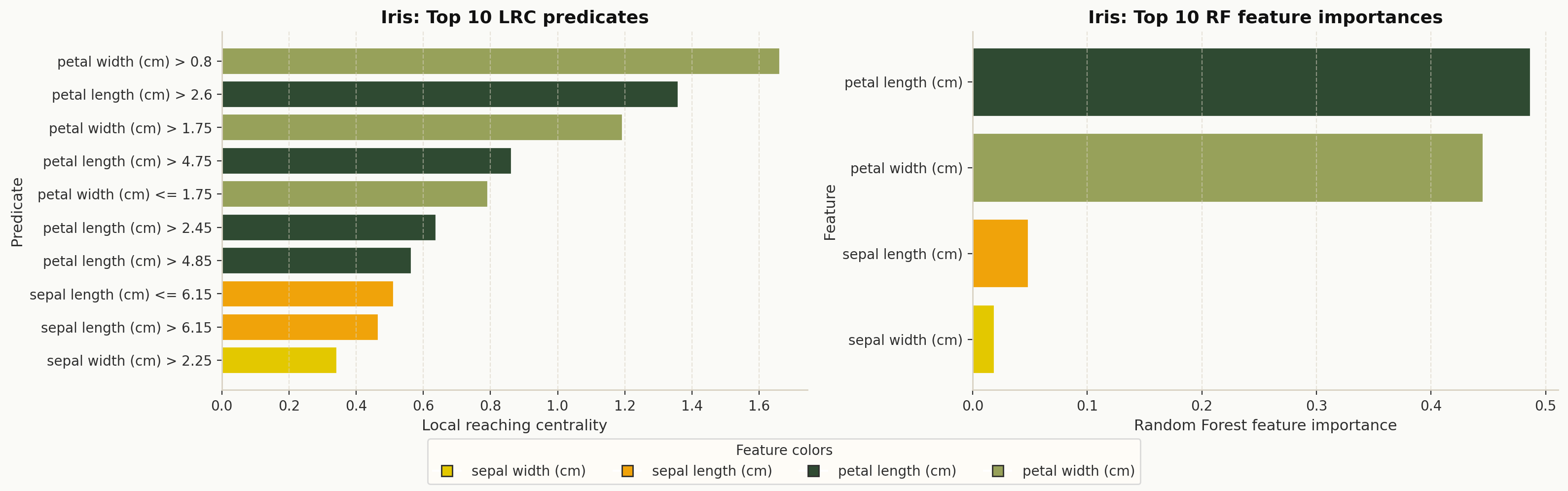
Top DPG predicates compared with Random Forest feature importance.#
4. Top predicate split lines in feature space#
Use explainer.plot_top_lrc_splits(...) or dpg.plot_top_lrc_predicate_splits(...)
to overlay important split thresholds on the most relevant feature pair.
explainer.plot_top_lrc_splits(
    X,
    y,
    explanation=explanation,
    dataset_name="Iris",
    top_predicates=5,
    theme="dpg",
    palette="olive",
)
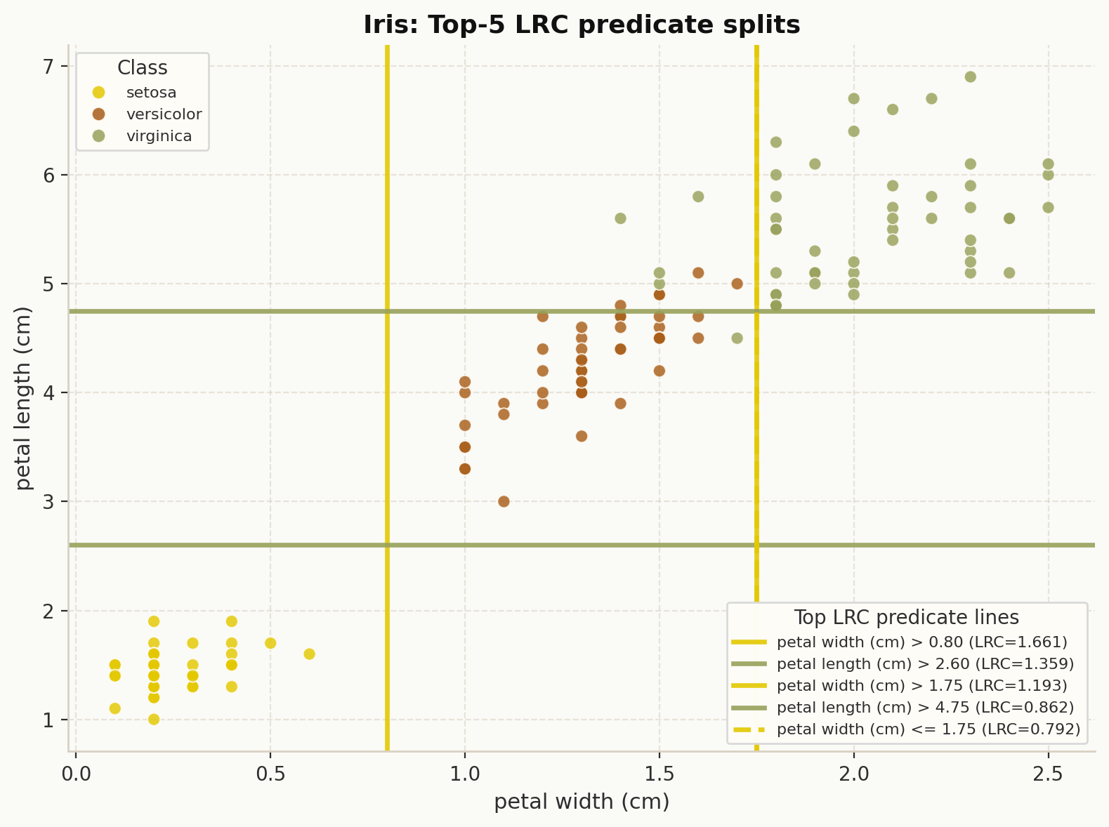
Top LRC predicate thresholds drawn over the selected feature space.#
5. Bottleneck-centrality sample cloud#
Use explainer.plot_sample_using_bc_weights(...) or
dpg.plot_sample_using_bc_weights(...) to project samples into PCA space and scale
point size by BC-derived predicate exposure.
explainer.plot_sample_using_bc_weights(
    X,
    y,
    explanation=explanation,
    dataset_name="Iris",
    top_k=10,
    theme="dpg",
    palette="olive",
)
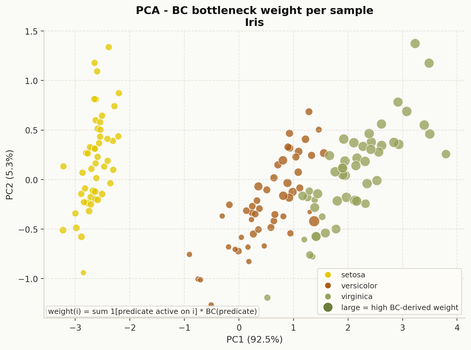
Samples in PCA space sized by BC-derived bottleneck weight.#
6. DPG class bounds vs dataset feature ranges#
Use explainer.plot_class_bounds_vs_dataset_ranges(...) or
dpg.plot_dpg_class_bounds_vs_dataset_feature_ranges(...) to compare DPG-derived
constraints against empirical per-class feature ranges.
explainer.plot_class_bounds_vs_dataset_ranges(
    X,
    y,
    explanation=explanation,
    dataset_name="Iris",
    top_features=4,
    theme="dpg",
    palette="olive",
)
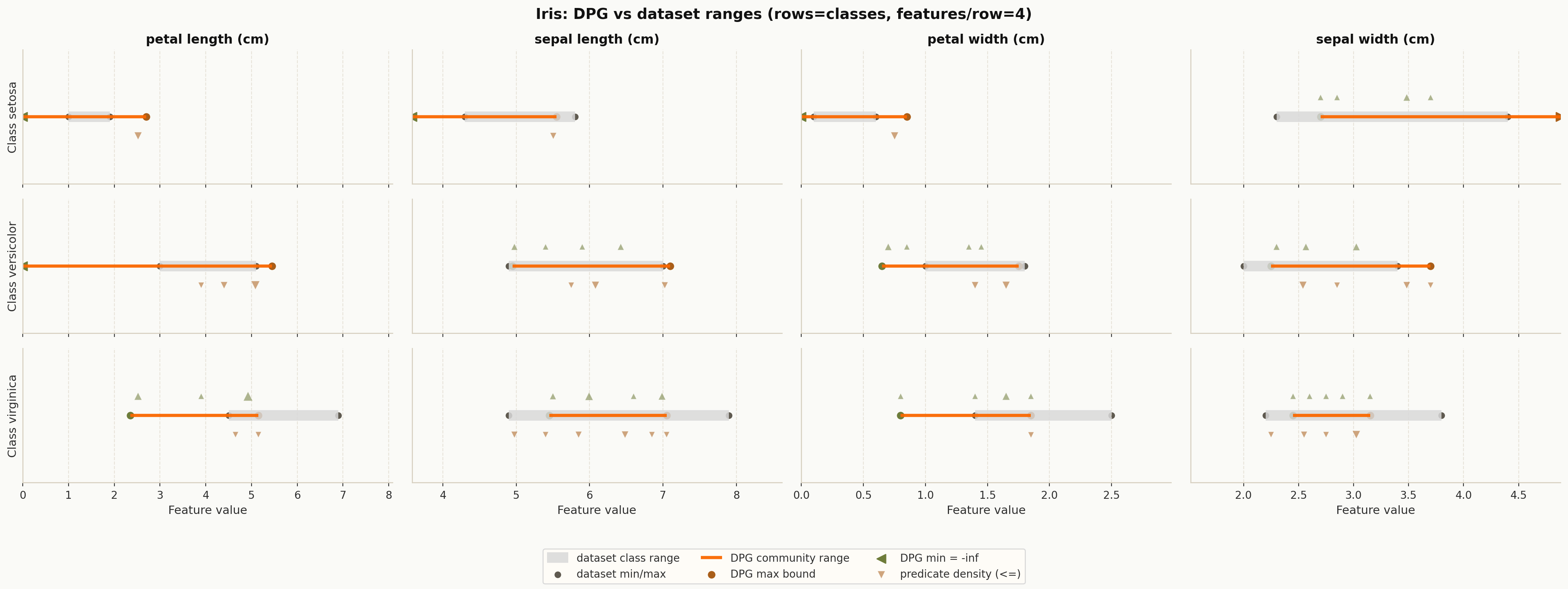
DPG class bounds compared with empirical dataset ranges.#
This view is especially useful when you want to inspect which feature ranges are well separated by the graph structure.
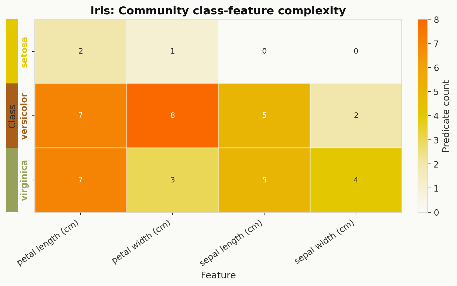
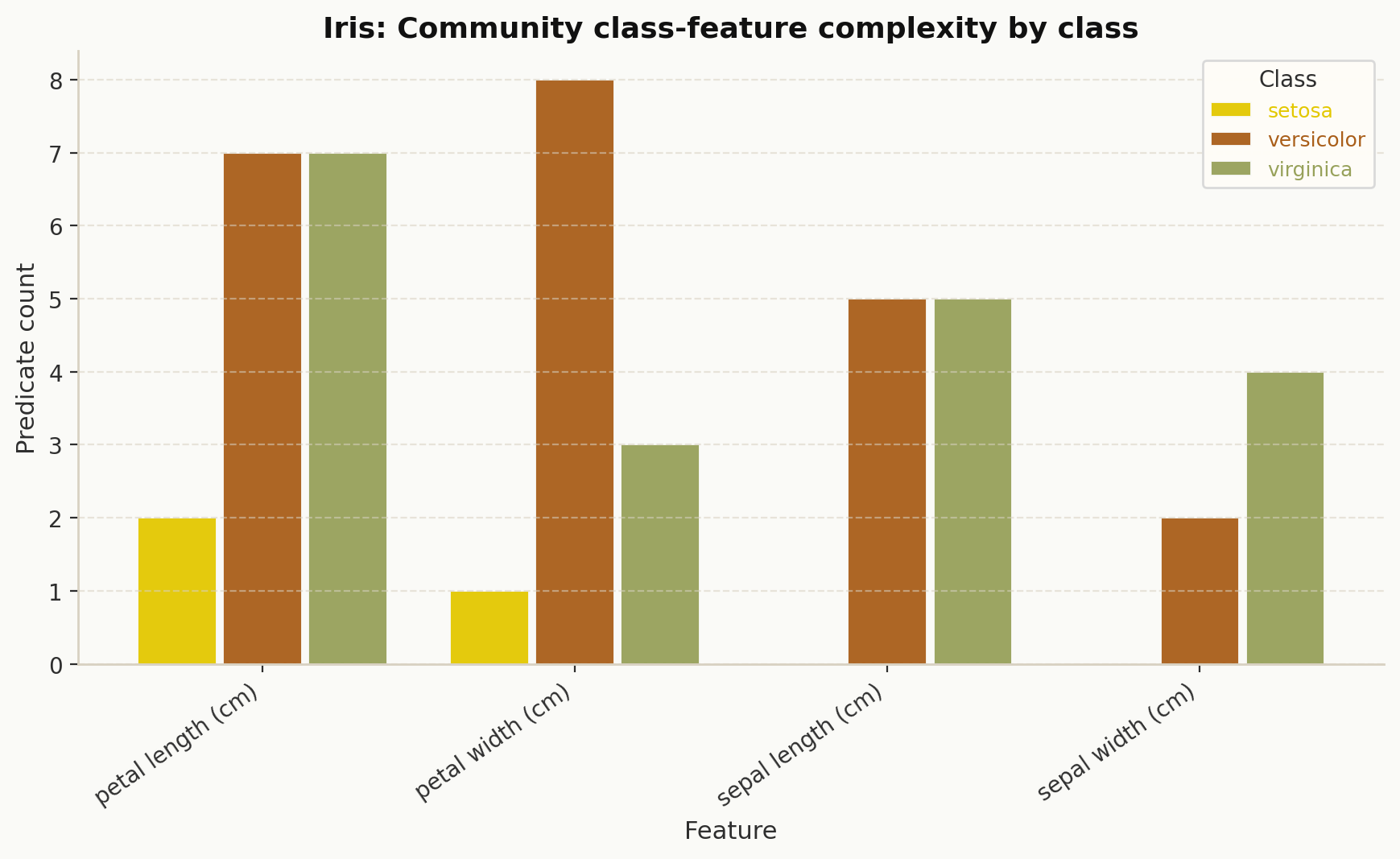
Derived community summaries#
DPG also exposes helper functions that return tables you can plot with pandas, Matplotlib, or seaborn.
Class-feature predicate counts#
explainer.class_feature_predicate_counts(...) returns a class-by-feature count matrix
derived from the community structure.
heat_df = explainer.class_feature_predicate_counts(explanation=explanation)
print(heat_df.head())
This is commonly turned into a heatmap or a per-class bar chart:
Bounds and predicate helpers#
These helpers are useful when building custom charts:
dpg.classwise_feature_bounds_from_communities(explanation)dpg.class_lookup_from_target_names(target_names)dpg.sample_bc_weights(explanation, X_df, top_k=10)
Low-level plotting utilities#
Most users can stay with DPGExplainer, but two lower-level utilities are also
available:
plot_dpg_reg#
Regression-oriented DPG renderer with optional node coloring by metric or community. Use this when working directly with a regression-style DPG pipeline.
plot_dpg_constraints_overview#
Standalone constraint overview chart for visualizing normalized class constraints across features, optionally including the original sample and class transition.
from dpg import plot_dpg_constraints_overview

fig = plot_dpg_constraints_overview(
    normalized_constraints=normalized_constraints,
    feature_names=feature_names,
    class_colors_list=["#4c78a8", "#f58518", "#54a24b"],
    title="DPG Constraints Overview",
)
Example snippets for all current plot methods#
This section gives a minimal usage example for each plotting method currently exposed by DPG.
DPGExplainer.plot#
explainer.plot(
    "iris_dpg",
    explanation=explanation,
    save_dir="results/",
    attribute="Local reaching centrality",
    class_flag=True,
    theme="dpg",
    palette="default",
)
DPGExplainer.plot_communities#
explainer.plot_communities(
    "iris_dpg",
    explanation=explanation,
    save_dir="results/",
    class_flag=True,
    community_threshold=0.2,
    theme="dpg",
    palette="olive",
)
DPGExplainer.plot_lrc_importance#
explainer.plot_lrc_importance(
    X,
    explanation=explanation,
    top_k=10,
    dataset_name="Iris",
    save_path="results/lrc_vs_rf_importance.png",
    show=False,
    theme="dpg",
    palette="olive",
)
DPGExplainer.plot_top_lrc_splits#
explainer.plot_top_lrc_splits(
    X,
    y,
    explanation=explanation,
    top_predicates=5,
    top_features=2,
    dataset_name="Iris",
    class_names=["setosa", "versicolor", "virginica"],
    save_path="results/top_lrc_predicate_splits.png",
    show=False,
    theme="dpg",
    palette="olive",
)
DPGExplainer.plot_sample_using_bc_weights#
explainer.plot_sample_using_bc_weights(
    X,
    y,
    explanation=explanation,
    top_k=10,
    dataset_name="Iris",
    class_names=["setosa", "versicolor", "virginica"],
    save_path="results/bc_bottleneck_pca_cloud.png",
    show=False,
    theme="dpg",
    palette="olive",
)
DPGExplainer.plot_class_bounds_vs_dataset_ranges#
explainer.plot_class_bounds_vs_dataset_ranges(
    X,
    y,
    explanation=explanation,
    dataset_name="Iris",
    top_features=4,
    feature_cols_per_row=2,
    save_path="results/dpg_vs_dataset_feature_ranges.png",
    show=False,
    theme="dpg",
    palette="olive",
)
dpg.plot_dpg#
from dpg import plot_dpg

plot_dpg(
    "iris_dpg",
    explanation.dot,
    explanation.node_metrics,
    explanation.edge_metrics,
    save_dir="results/",
    attribute="Local reaching centrality",
    class_flag=True,
    theme="dpg",
    palette="default",
)
dpg.plot_dpg_communities#
from dpg.visualizer import plot_dpg_communities

plot_dpg_communities(
    "iris_dpg",
    explanation.dot,
    explanation.node_metrics,
    explanation.communities,
    save_dir="results/",
    class_flag=True,
    theme="dpg",
    palette="olive",
)
dpg.plot_lrc_vs_rf_importance#
from dpg import plot_lrc_vs_rf_importance

plot_lrc_vs_rf_importance(
    explanation,
    model,
    X,
    top_k=10,
    dataset_name="Iris",
    save_path="results/lrc_vs_rf_importance.png",
    show=False,
    theme="dpg",
    palette="olive",
)
dpg.plot_lec_vs_rf_importance#
from dpg import plot_lec_vs_rf_importance

# Deprecated alias kept for backward compatibility.
plot_lec_vs_rf_importance(
    explanation,
    model,
    X,
    top_k=10,
    dataset_name="Iris",
    save_path="results/lrc_vs_rf_importance_alias.png",
    show=False,
    theme="dpg",
    palette="olive",
)
dpg.plot_top_lrc_predicate_splits#
from dpg import plot_top_lrc_predicate_splits

plot_top_lrc_predicate_splits(
    explanation,
    X,
    y,
    top_predicates=5,
    top_features=2,
    dataset_name="Iris",
    class_names=["setosa", "versicolor", "virginica"],
    save_path="results/top_lrc_predicate_splits.png",
    show=False,
    theme="dpg",
    palette="olive",
)
dpg.plot_sample_using_bc_weights#
from dpg import plot_sample_using_bc_weights

plot_sample_using_bc_weights(
    explanation,
    X,
    y,
    top_k=10,
    dataset_name="Iris",
    class_names=["setosa", "versicolor", "virginica"],
    save_path="results/bc_bottleneck_pca_cloud.png",
    show=False,
    theme="dpg",
    palette="olive",
)
dpg.plot_dpg_class_bounds_vs_dataset_feature_ranges#
from dpg import plot_dpg_class_bounds_vs_dataset_feature_ranges

plot_dpg_class_bounds_vs_dataset_feature_ranges(
    explanation,
    X,
    y,
    dataset_name="Iris",
    top_features=4,
    feature_cols_per_row=2,
    save_path="results/dpg_vs_dataset_feature_ranges.png",
    show=False,
    theme="dpg",
    palette="olive",
)
dpg.plot_dpg_reg#
from dpg.visualizer import plot_dpg_reg

plot_dpg_reg(
    "iris_reg_view",
    explanation.dot,
    explanation.node_metrics,
    explanation.communities,
    save_dir="results/",
    attribute="Local reaching centrality",
    theme="dpg",
    palette="default",
)
plot_dpg_reg is a lower-level function intended for regression-oriented or
custom workflows. In most classification cases, prefer plot_dpg(...).
dpg.plot_dpg_constraints_overview#
from dpg import plot_dpg_constraints_overview

normalized_constraints = {
    "setosa": {
        "petal length (cm)": {"min": 1.0, "max": 1.9},
        "petal width (cm)": {"min": 0.1, "max": 0.6},
    },
    "versicolor": {
        "petal length (cm)": {"min": 3.0, "max": 5.1},
        "petal width (cm)": {"min": 1.0, "max": 1.8},
    },
    "virginica": {
        "petal length (cm)": {"min": 4.5, "max": 6.9},
        "petal width (cm)": {"min": 1.4, "max": 2.5},
    },
}

fig = plot_dpg_constraints_overview(
    normalized_constraints=normalized_constraints,
    feature_names=["petal length (cm)", "petal width (cm)"],
    class_colors_list=["#E3C800", "#F0A30A", "#FA6800"],
    output_path="results/constraints_overview.png",
    title="Iris constraints overview",
    theme="dpg",
    palette="olive",
)
Which plot should I use?#
Use
plotfor the main graph structure.Use
plot_communitieswhen cluster assignments matter.Use
plot_lrc_importanceto compare DPG signals with the underlying model.Use
plot_top_lrc_splitsto inspect important threshold predicates visually.Use
plot_sample_using_bc_weightsto see which samples activate bottleneck predicates.Use
plot_class_bounds_vs_dataset_rangesto compare learned constraints with real data ranges.